OBJECTIVES
“Allow anyone to shop, transfer money, and more without a debit or credit card or the need to visit a physical bank or store.”
DESIGN THINKING

A short research about how digital payment works is initiated with competitor analysis from a traditional banking app to more progressive fanancial services. User research involves recruiting interviewees from my target audience. A problem statement is then clearly defined and user stories are constructed.
Personas are created based on the interviewees’ commonalities. For each feature of the app I create an user flow and more specific task flows. Methods like Mental Model and User Journey Mapping are applied. A sitemap is constructed based on results from Card Sorting exercise to manage the web app’s structure.
Figma is the main tool for creating wireframes in digital format preparing prototype for Usability Testing, along with a test script and a test plan. The prototype is then re-adjusted based on the test's evaluation. A Preference Testing is used when the design choice is still indecisive. Finally, an unmoderated User Testing in survey form is conducted to collect further feedbacks.
In this step I go back to the POV to adjust my personas’ necessary traits to make the story coherent and engaging. For the final delivery I use a Vidyard for a short video presentation to demonstrate a walk-through of the app's main functionalities.
UNDERSTAND THE PROBLEM
-
Exclusive
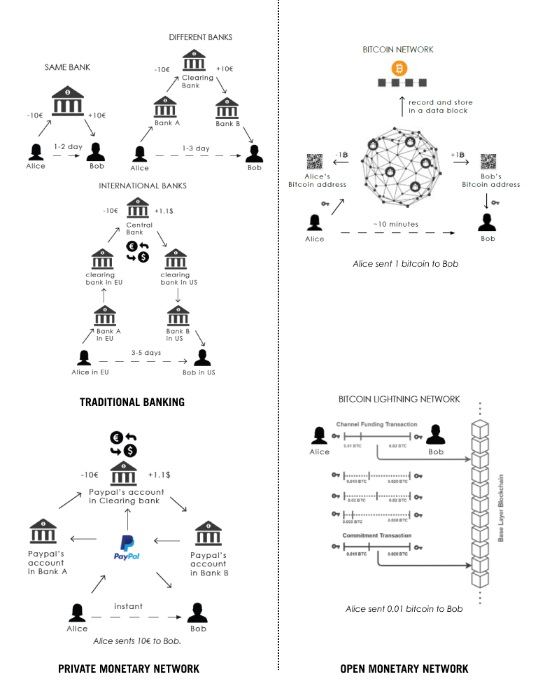
The underlying problem of the legacy financial system is still the access to a bank account. This exculdes the unbanked, the refugees, immigrants without a permanant address, the nomads or digital nomads etc.
-
Privacy & Trust
PayPal shares their users’ data to over 600 other third-parties. Banks and trust parties can unilaterally freeze users’ account and reverse transactions. Users never truly own their fund or their data.
-
International payment
Banking is the technology of the 19th century still operating in the context of the 21st century. The increasing demand for remittance each year still has to go through instutions like Western Union with high fee and long processing time.
-
All the problems of the legacy finacial system could be solved with the new open monetary networks, only that they are also facing other problems:
Resistence from current system
Banks and governments have been gatekeepers of the monetary systems for centuries. A disruptive technology for moving value across the internet permissionlessly creates an existential threat.
Steep learning curve
Open monetary networks using cryptocurrencies are completely different from conventional ones. They also introduce the concept of “self-custody” or “being your own bank”. To enter this space, users need to be relatively technological competent because the transactions in the network can’t be reserved.
COMPETITOR ANALYSIS
Institution
ING is a pretigious bank. The app design also reflects its rigid but trust-worthy features. However, in the new context of global economy and the latest development in FinTech, banks cannot compete with softwares that never sleep.
Corperation
PayPal has the largest network by users since 2000. Its app is still user-friendly but lacks the innovation edge. The company’s strategy is an aggressive expansion by acquiring smaller online payment services like Xoom, iZettle and Venmo.
Start-up
Revolut offers all-in-one solution in a Super app. The design reflects exactly that and makes it rather overwhelming and overcrowded with choices. Option to trade cryptocurrencies is available as assets, not as payment.
Grassroots
BlueWallet is a Bitcoin wallet with support for the Lightning Network. The project is open-source and developed by its community. The app design is simple, almost too basic, but easy to use for a complex product.
NGO
Valora wallet is a part of the project initiated by the Celo Foundation with focus on financial inclusion and social good. The app design is highly asthetical, with a young, fresh and modern touch. The challenge here is its own currency celo adding more complexity.
PROBLEM STATEMENT
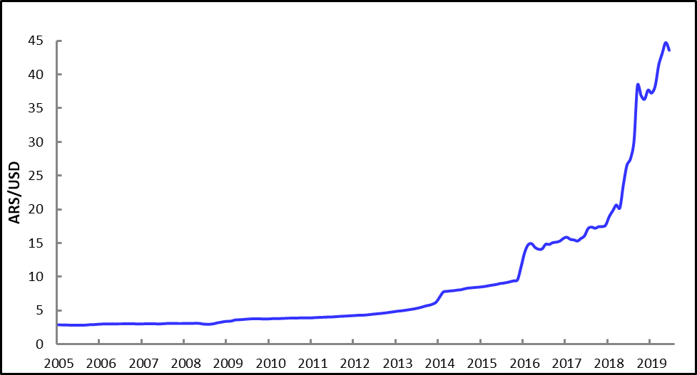
“Users need a way to preserve their purchasing power using a better form of money rather than their local debased currency. They also need to be able to send money to each other fast and with low fee.”
HYPOTHESIS
"We will know this to be true when we see users use PlutoPay as an application to manage their savings in bitcoin and use the integrated Lightning Network for other money transfer without having to convert back to the local currency."
PERSONAS
I aim to be inclusive in my design, so my second persona is someone in the older demography who is reluctant to use any new form of digital payment. To make the story more coherent, the two personas are family-related. It is not unusual that children teach their parents or grandparents how to use the computer or speak english. They could teach them to how use digital wallets, too.

DIEGO MARTINEZ
22, student, lives with his parents and siblings. He's at 3rd year of System Engineering at National University of Córdoba, Argentina.
GOALS & NEEDS
- upgrade his computer and buy some new gears.
- start a YouTube channel showing his crew’s skating tricks, or gaming techniques.
- extra income because the part-time job pays little.
MOTIVATION
- feeling cool about updating latest trends in Tech.
- being able to self-sustain and help his family when he finishes studying.
FRUSTRATION
- Imported electronics in Argentina are very expensive because of high tax.
- He also wants to try out other cool things but doesn’t have enough money.
- His friends can’t stop talking about this bitcoin and crypto thing but he hasn’t understood it fully yet.
QUOTES
“I saw my parents and grandparents struggle to keep up with life. I want a change for my generation.”
“There’re so many cool things happening now in the tech world with this thing called Bitcoin and crypto. I want to be part of it.”

LUIS MARTINEZ
70, pensioner, lives with his wife. His three children and six grandchilden all live in the neighbour.
GOALS & NEEDS
- extend his house so more family members can fit in.
- support and care for his grandchildren. He wrote them checks as birthday gifts from his saving account.
MOTIVATION
- good life for his family
- being surrounded by young people makes him feel young.
- everyday is a new opportunity to learn new things.
FRUSTRATION
- His pension from the army is considered the best pension in Argentina, and they’re careful with spending. Yet each month he can see their budget can buy less things because they got more expensive.
- still trying out his smart phone. He can WhatsApp in the family group but doesn’t know much about other buttons.
QUOTES
“My old friends and I prefer certain ways for things in life. We often talk about the old days. But our opinions don’t matter. We’ll be gone soon. It’s the generation of my grandchildren that should take over the future of this country.”
“Apart from the house, I hope I can have some savings left for my family.”
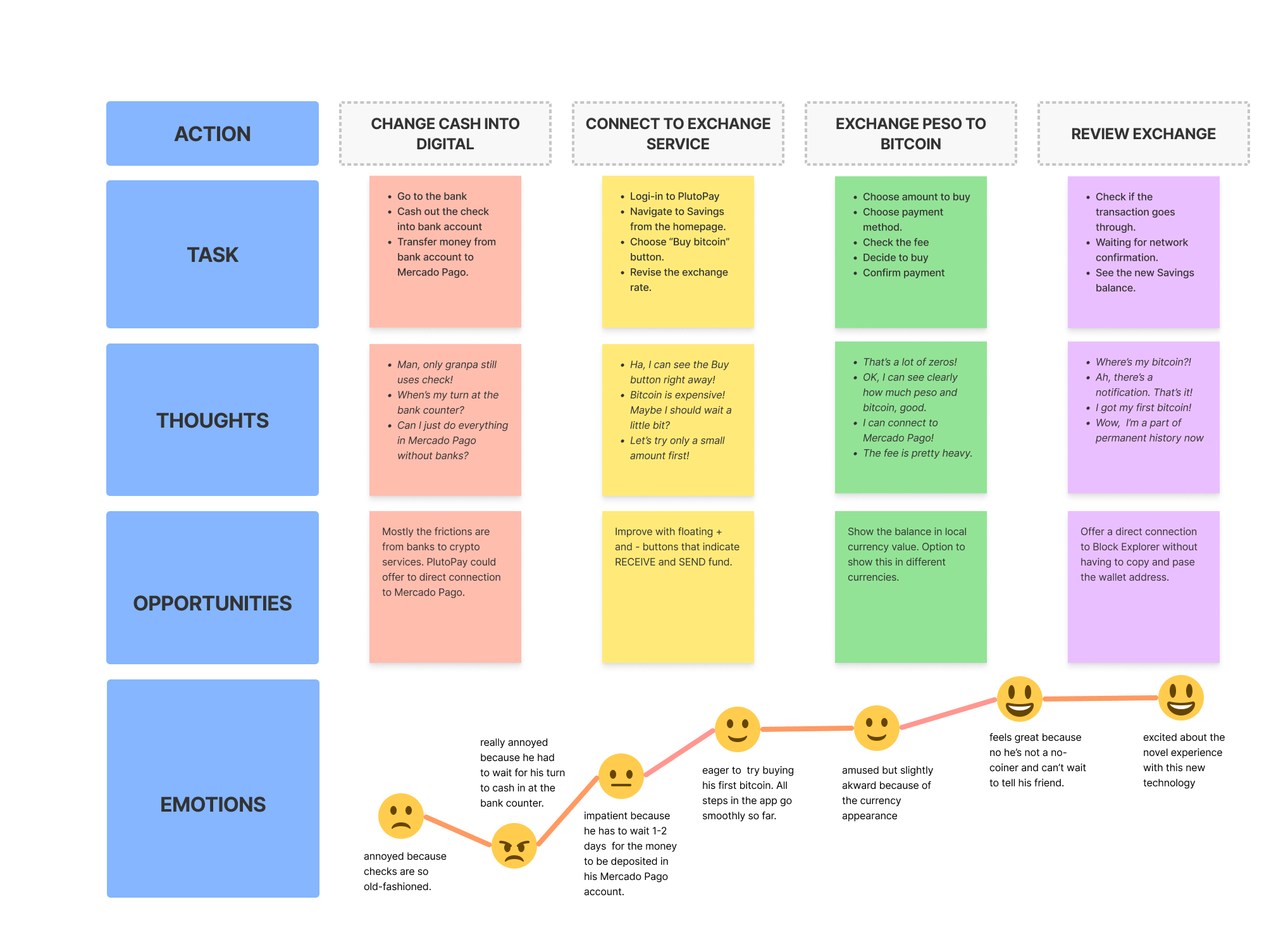
USER JOURNEY MAP
-
Scenario
Diego already did his research about Bitcoin and created his savings account in PlutoPay. He wants now to buy his first bitcoin with the check he received from his grandfather Luis as a birthday gift.
-
Goal and Expectation
Buy his first bitcoin and get familiar with bitcoin transaction.
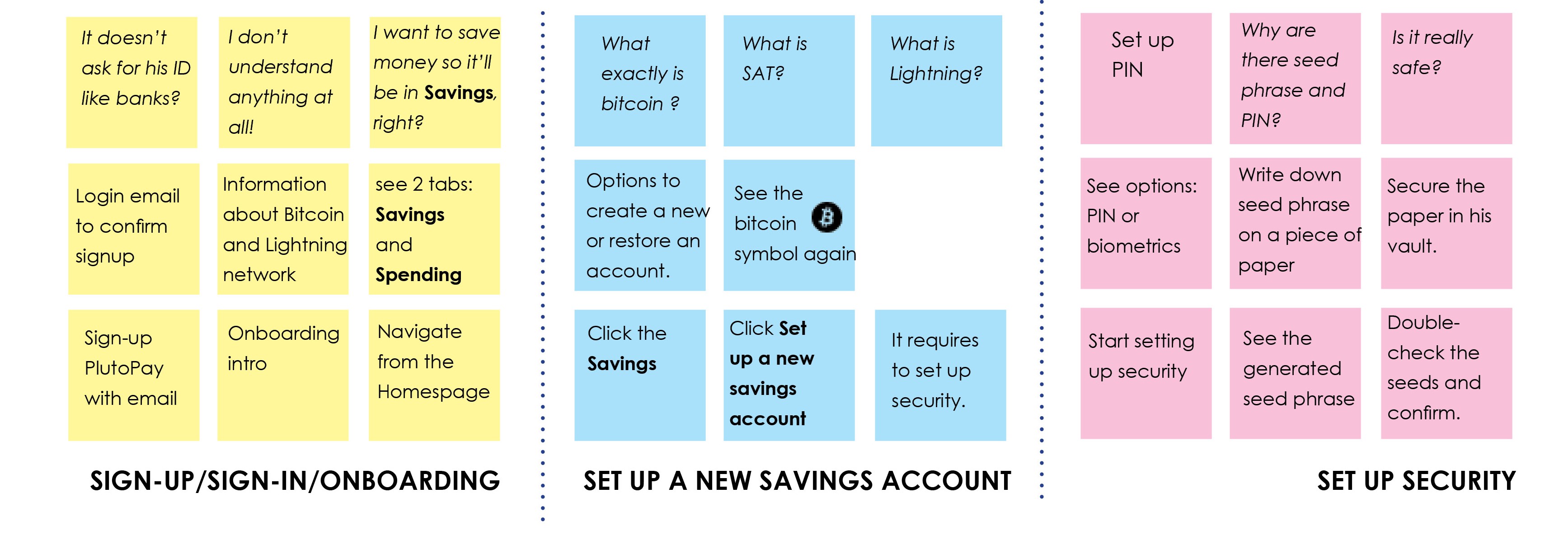
MENTAL MODEL
-
Scenario
Luis is already convinced by Diego to create a savings account with PlutoPay. He does not understand this digital money, but he trusts Diego. He knows his grandson is competent in new technology and can help him to take care of his finance. Besides, what else could he do with the peso?
-
Goal and Expectation
Set up a savings account in bitcoin.
ITERATIVE DESIGN
ONBOARDING
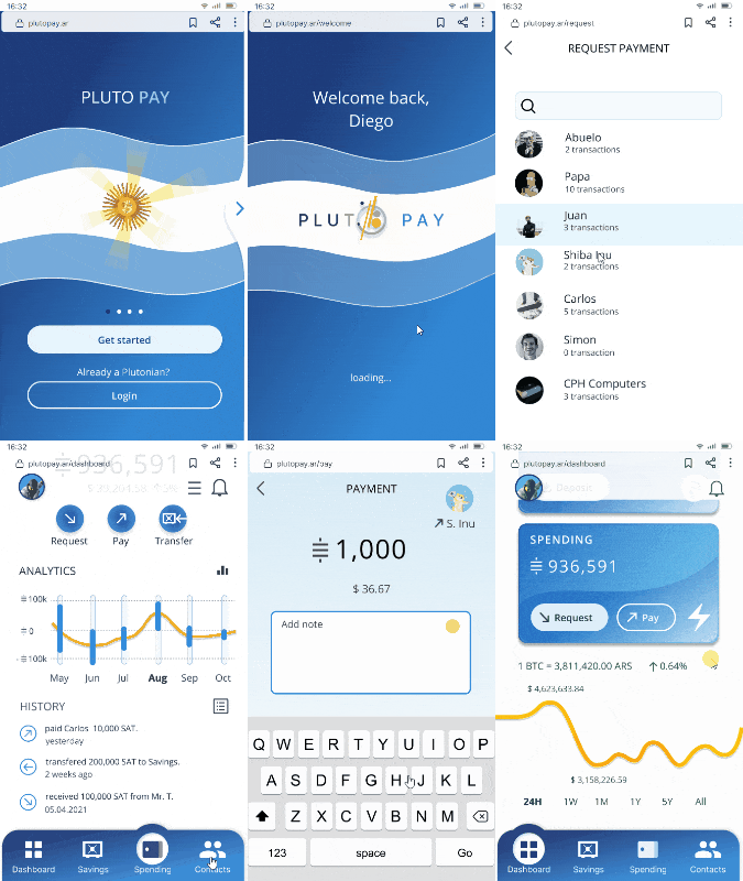
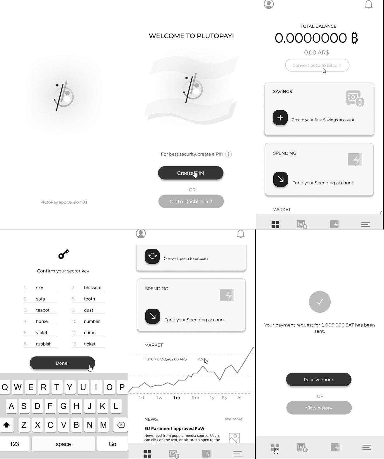
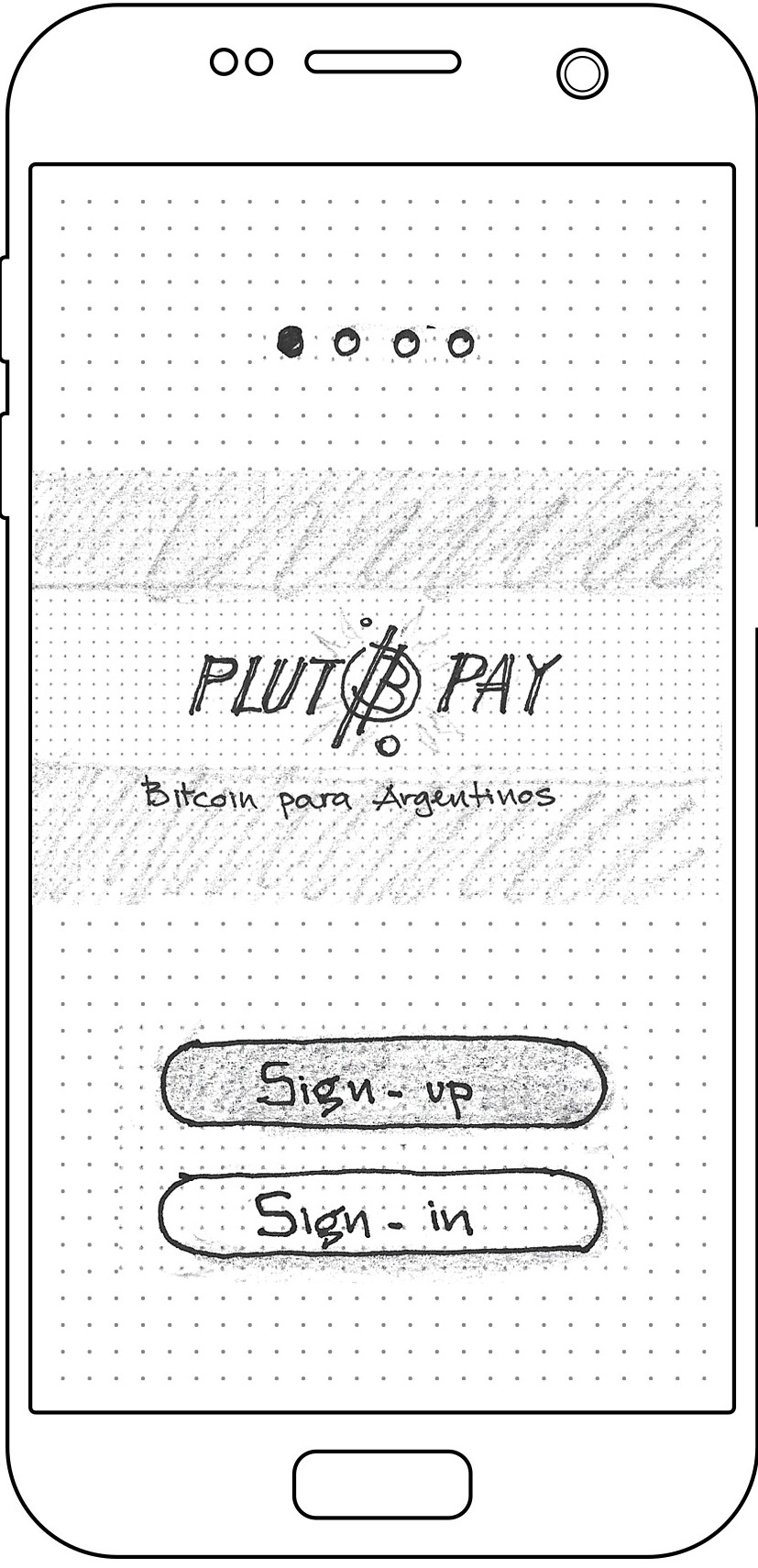
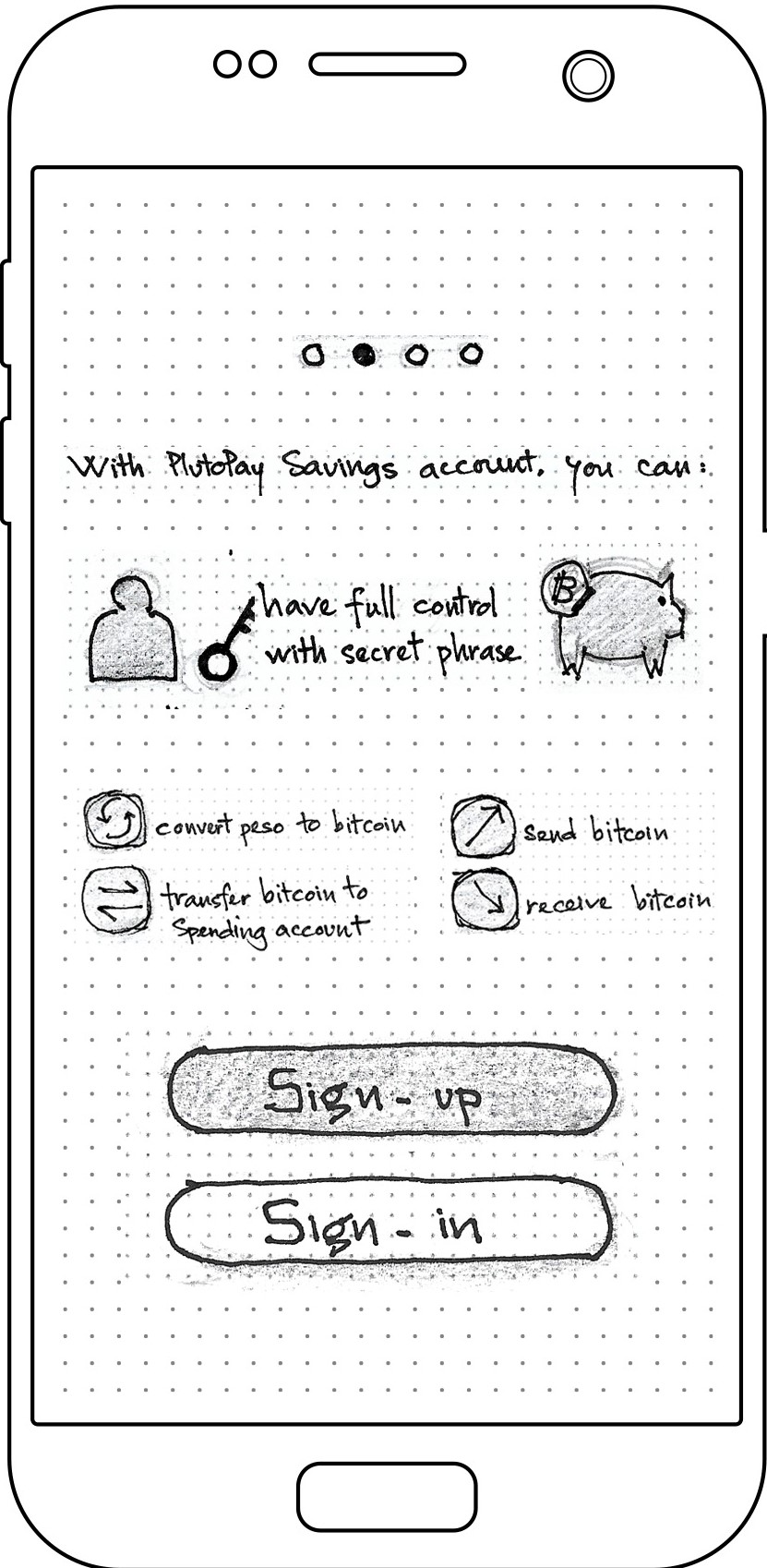
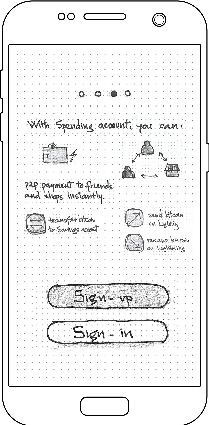
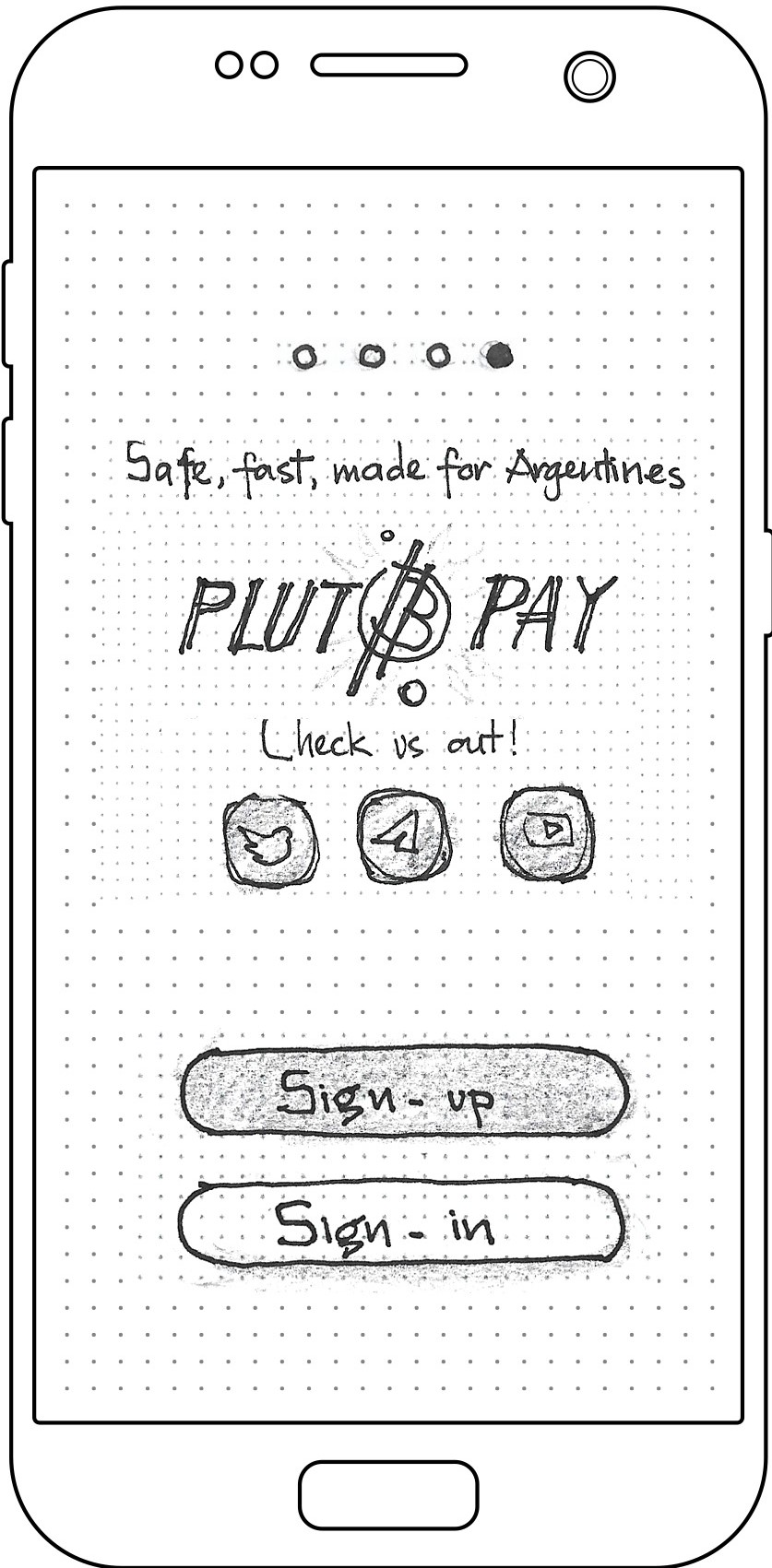
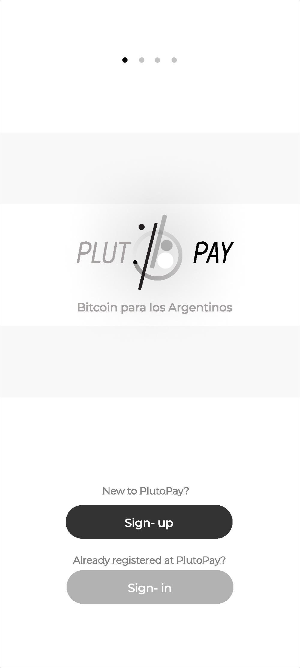
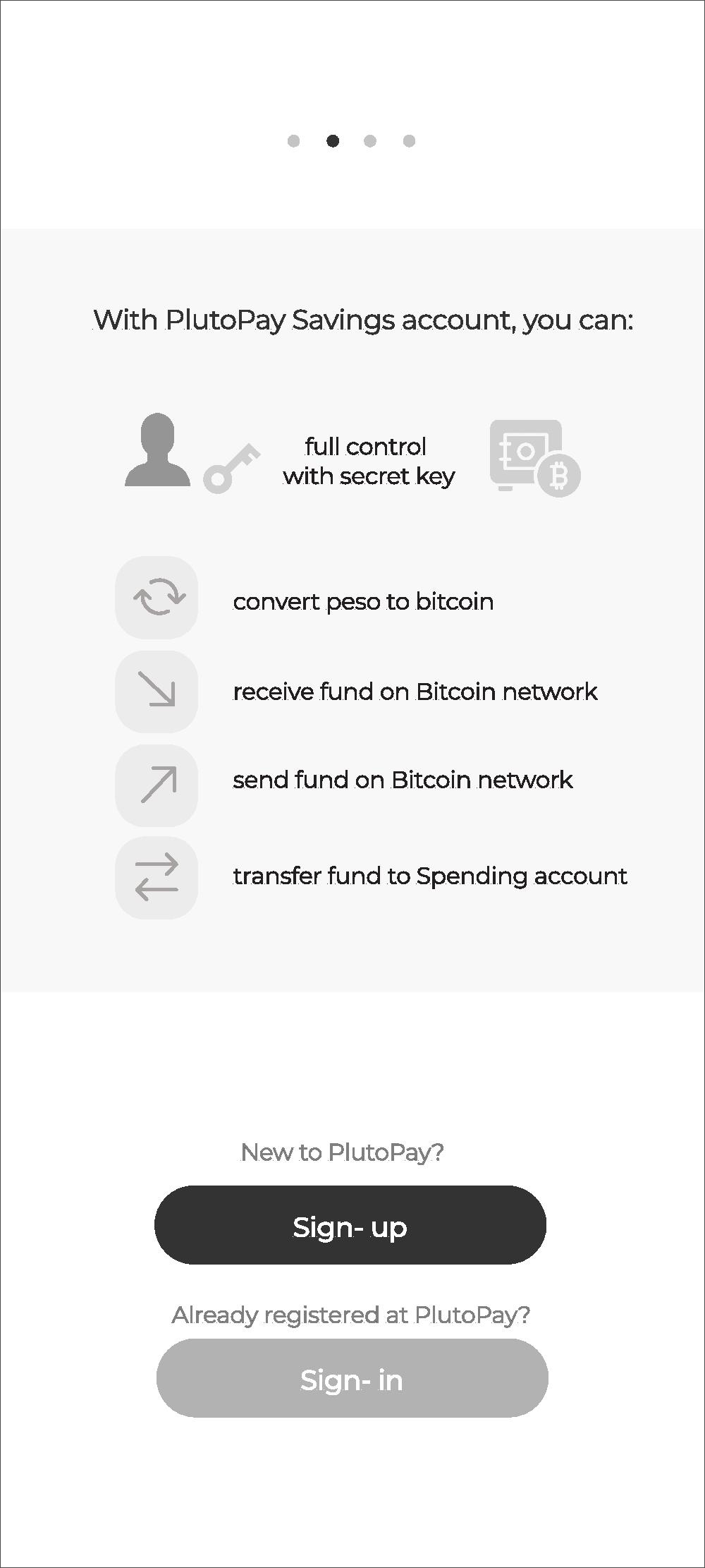
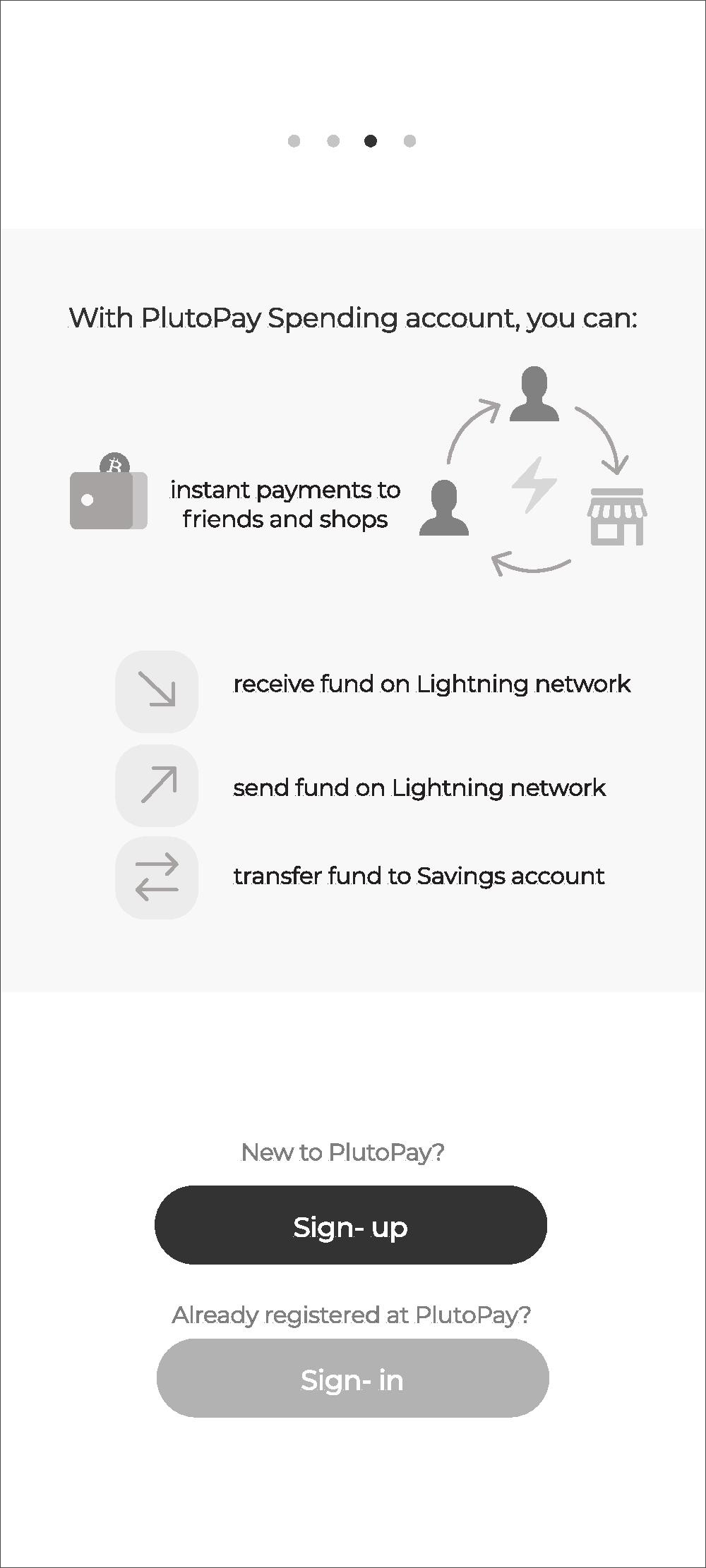
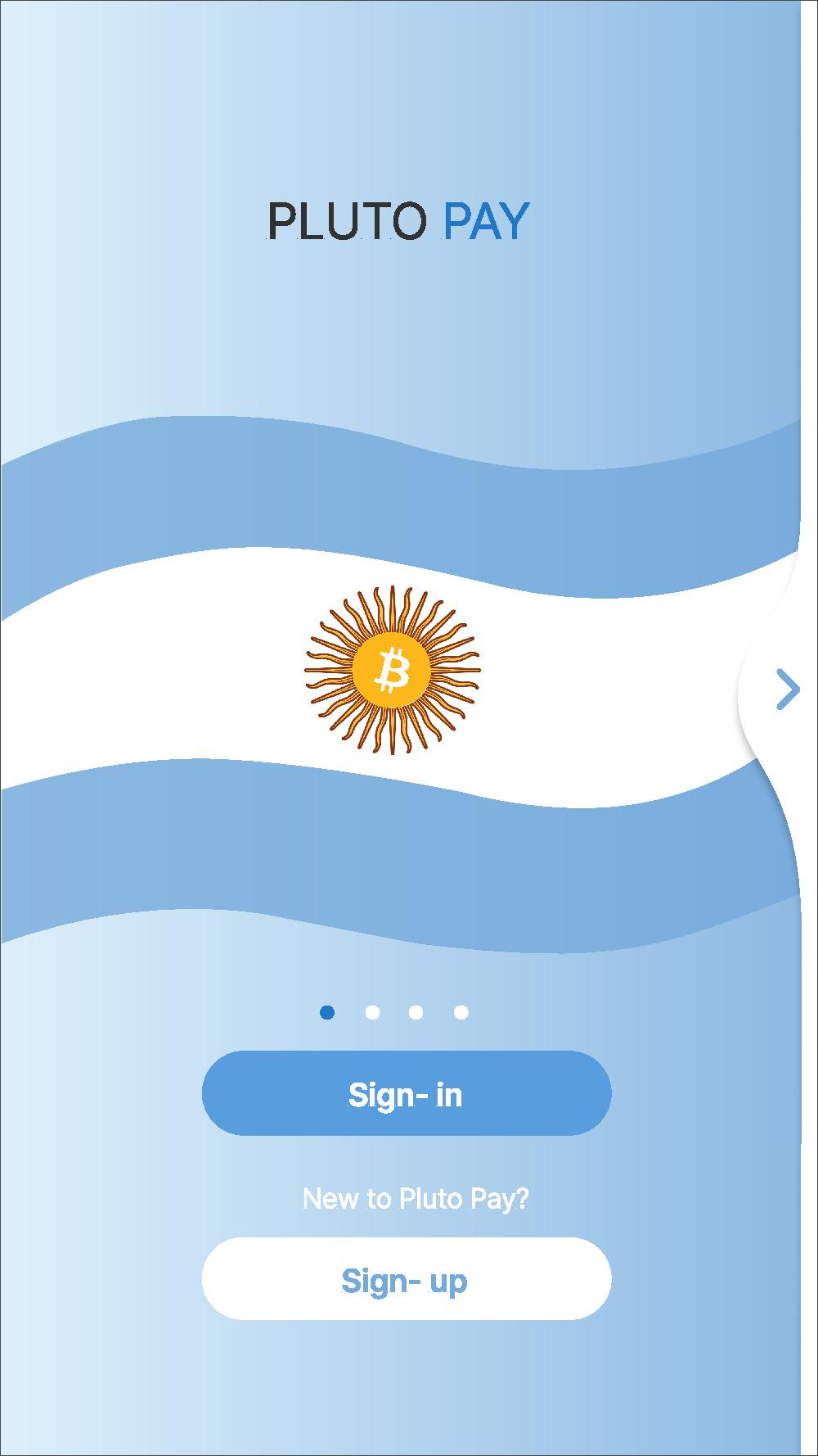
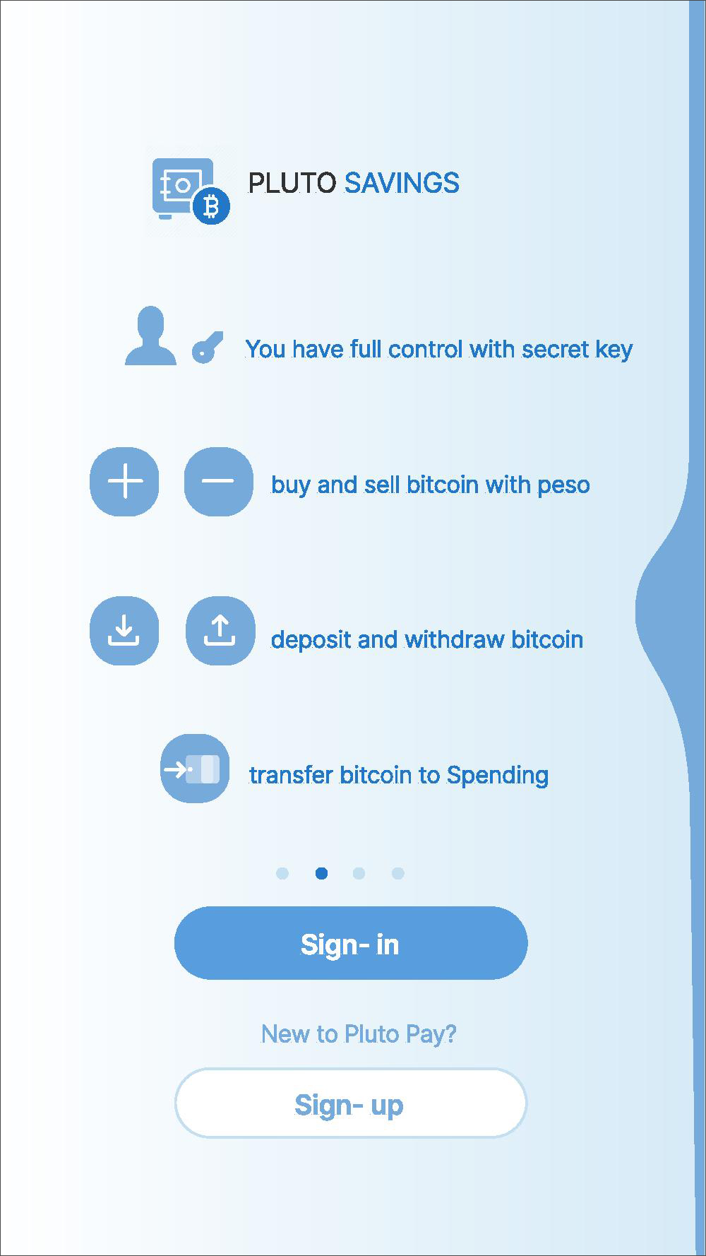
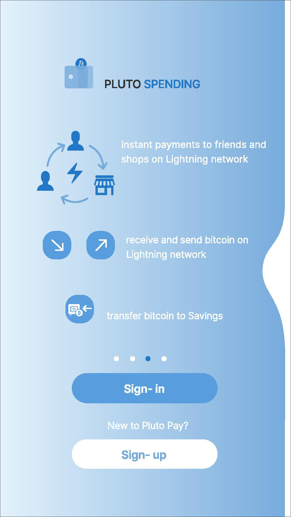
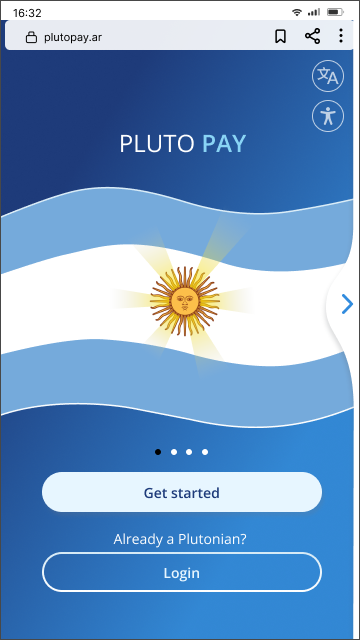
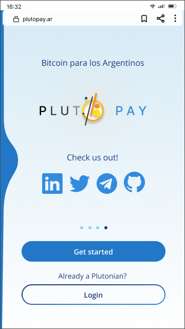
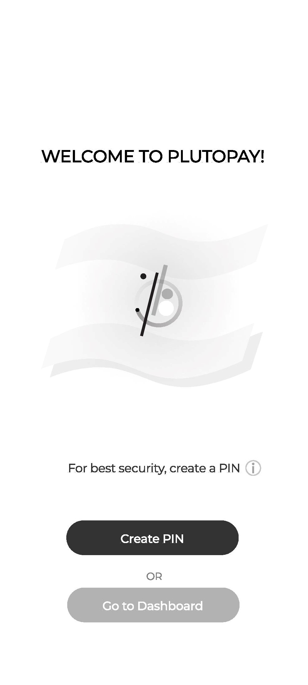
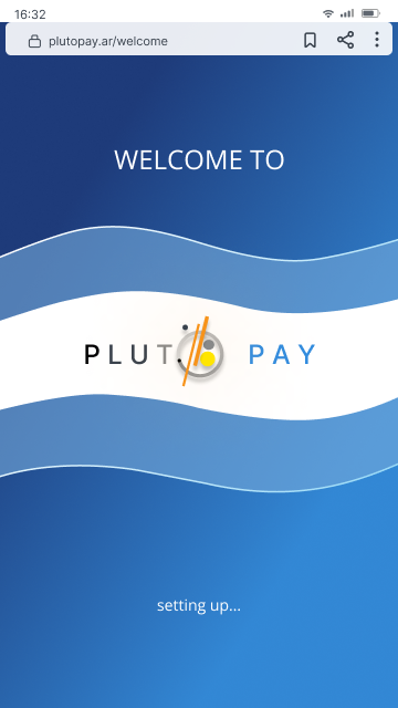
The argentinean flag is used as a background image to create familarity and to build local trust. From the Usability Testing I noticed the participants just swiped their way through the screens without reading the introduction for long. So I tweak the design to be more engaging by adding emotional design and little animation. The idea is to make it like opening first pages of a book.
SIGN UP / SIGN IN
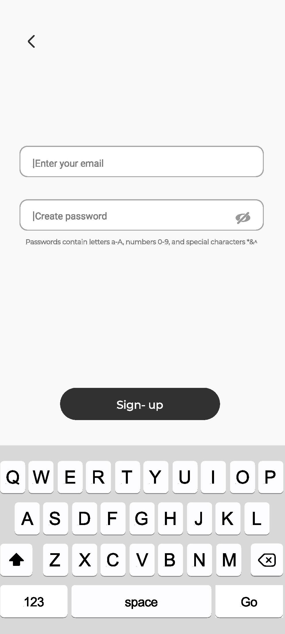
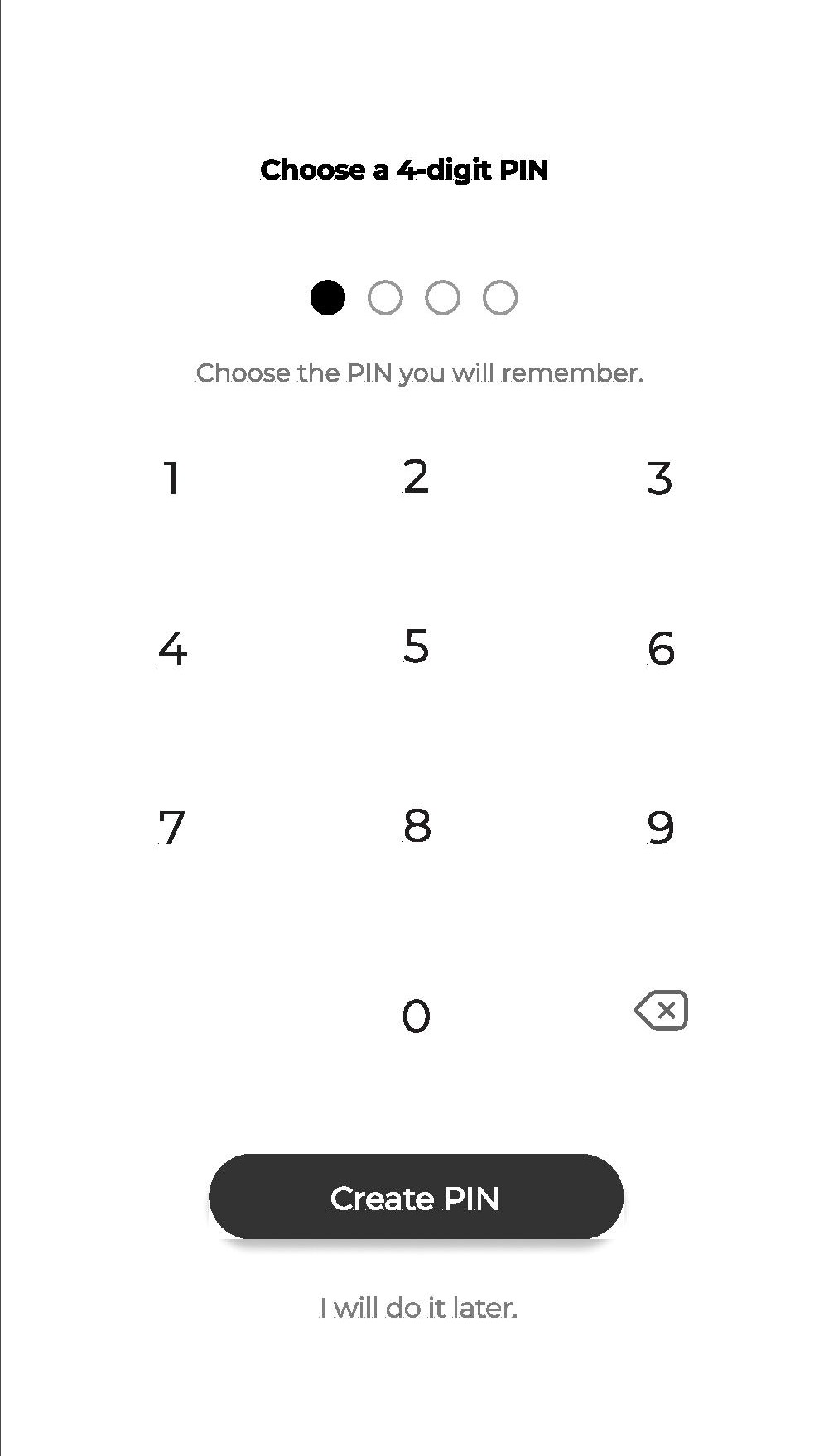
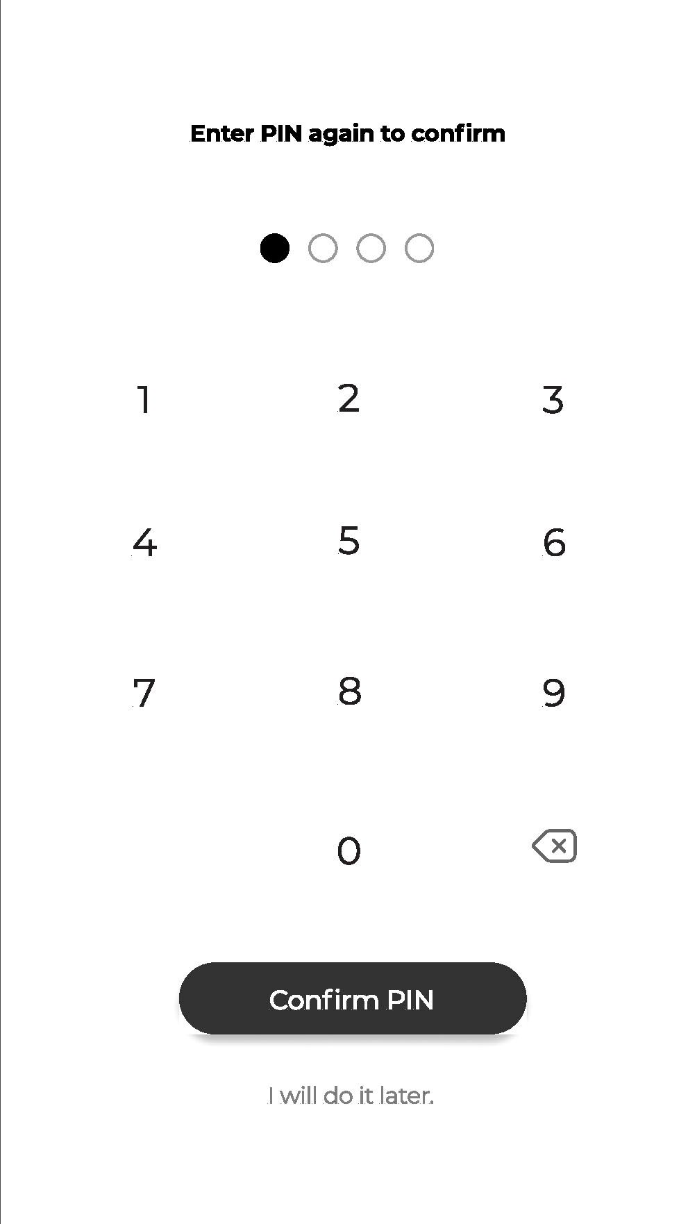
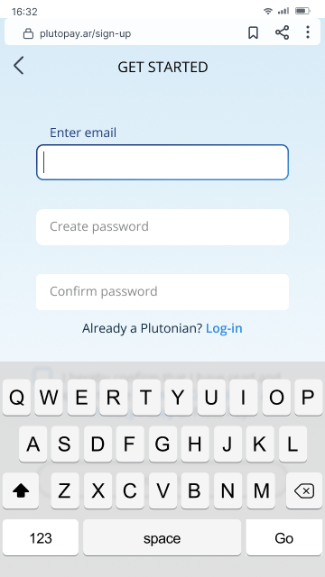
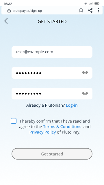
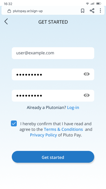
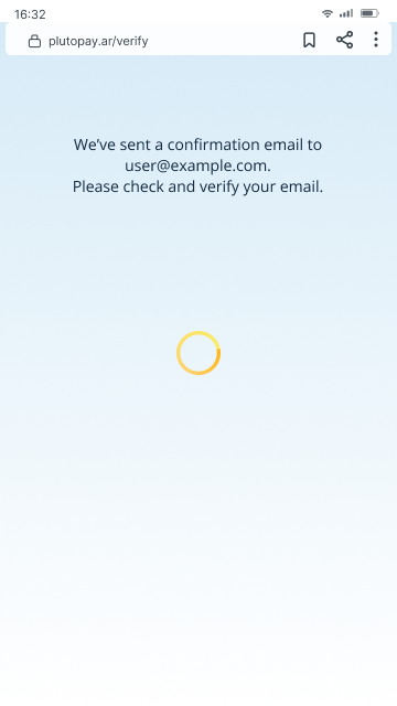
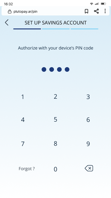
The Sign-up/Sign-in started with rather complicated design. In my opinion, a financial app requires high caution from the beginning, hence the code and PIN. The Usability Testing revealed that creating PIN right after signing up is unusal. I remove this step and make the Sign-up/Sign-in process as simple and painless as possible.
CREATE A SAVINGS ACCOUNT
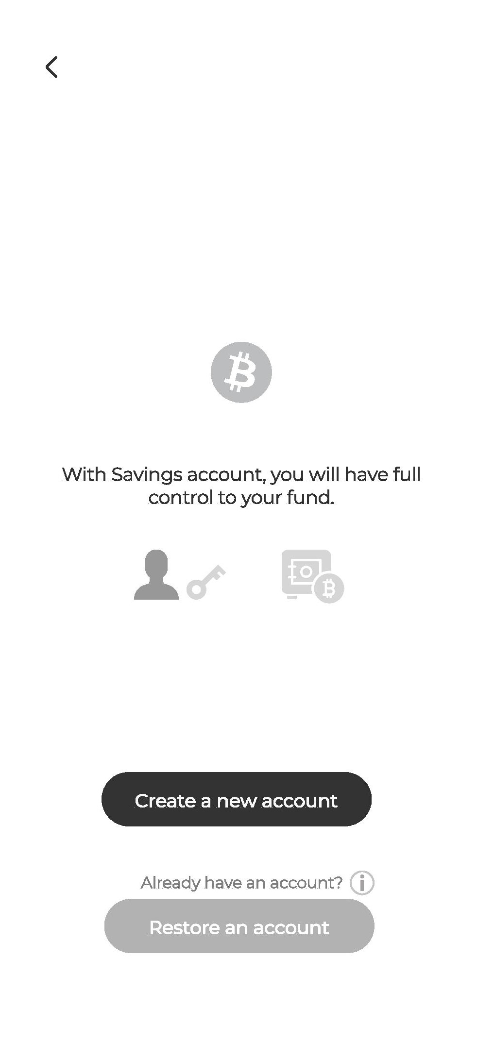
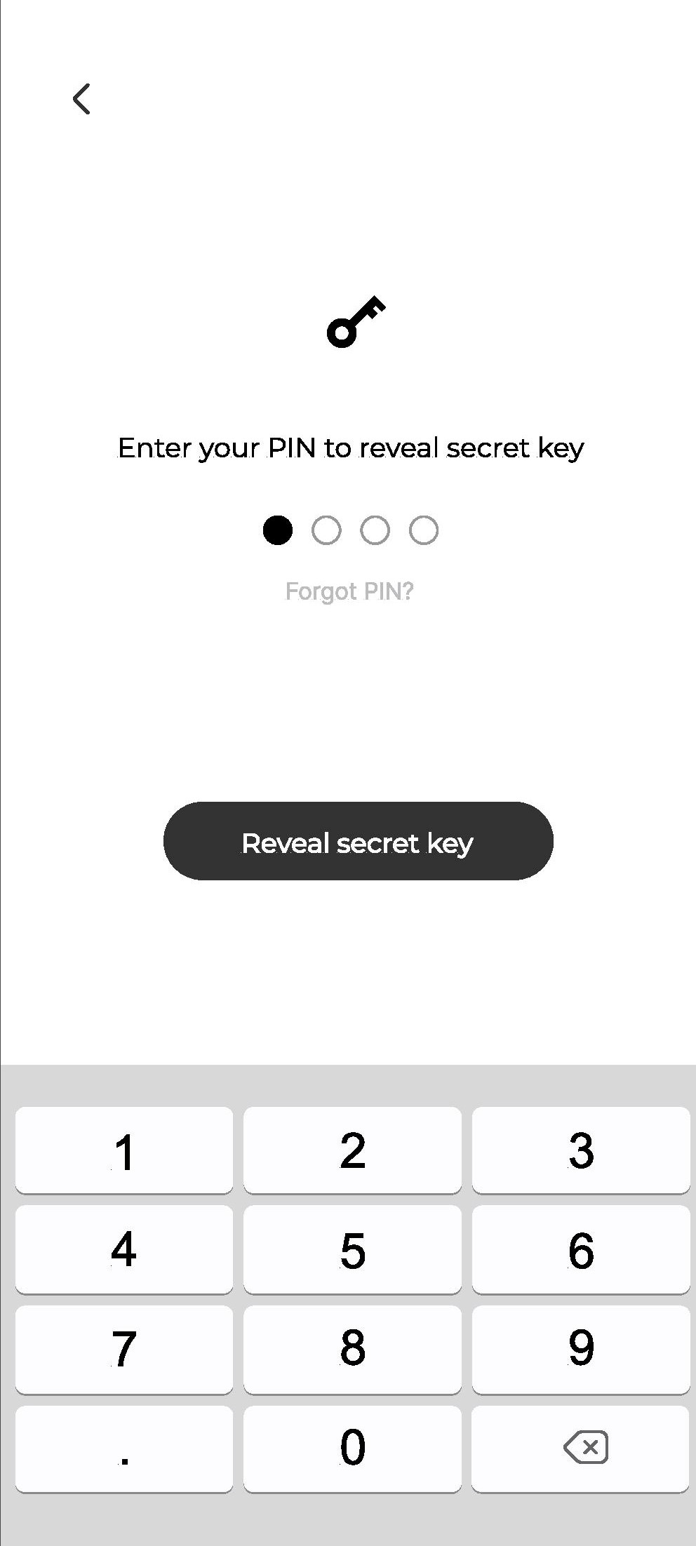
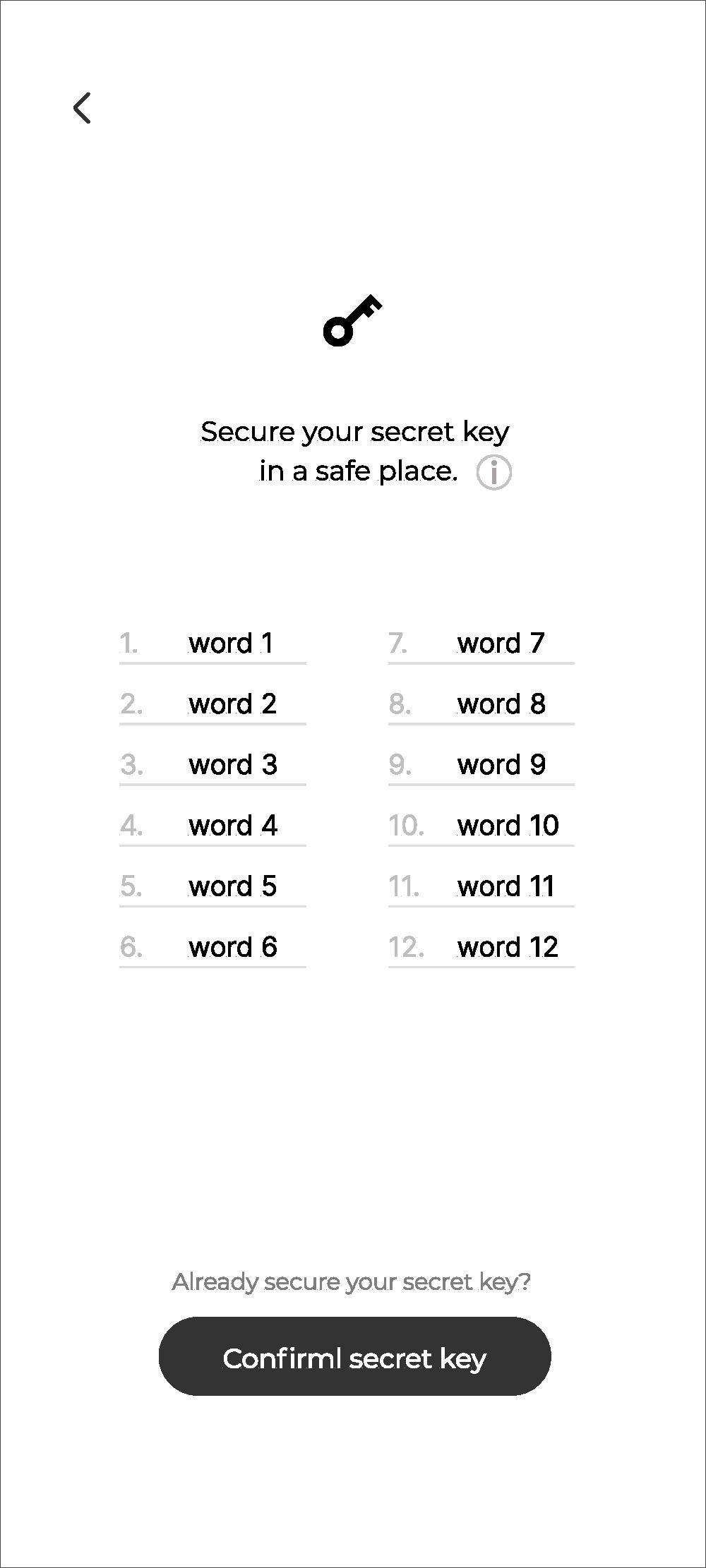
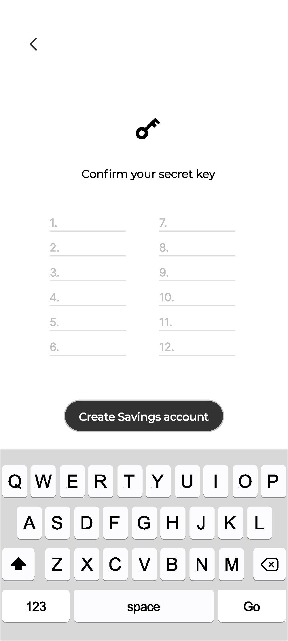
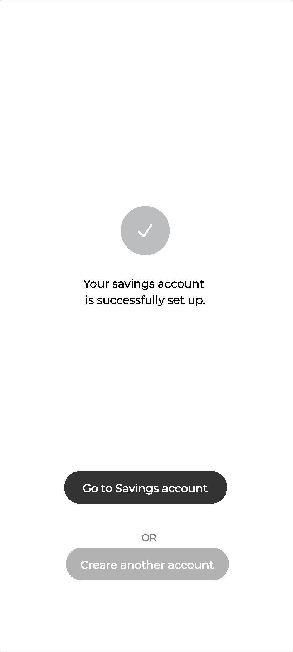
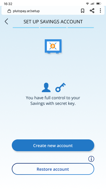
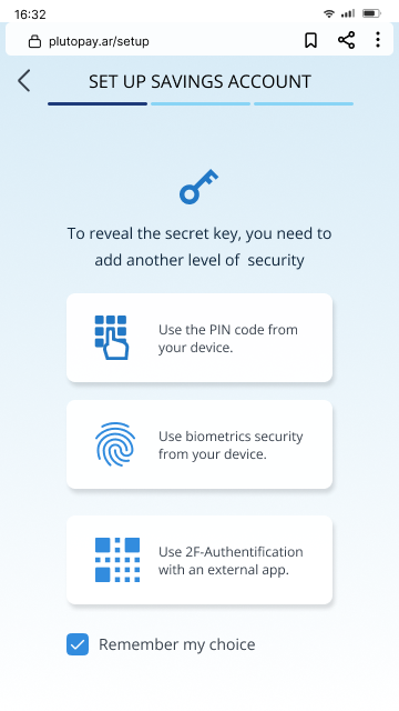
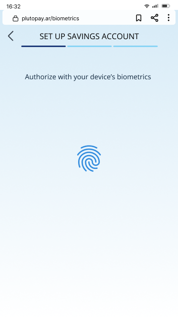
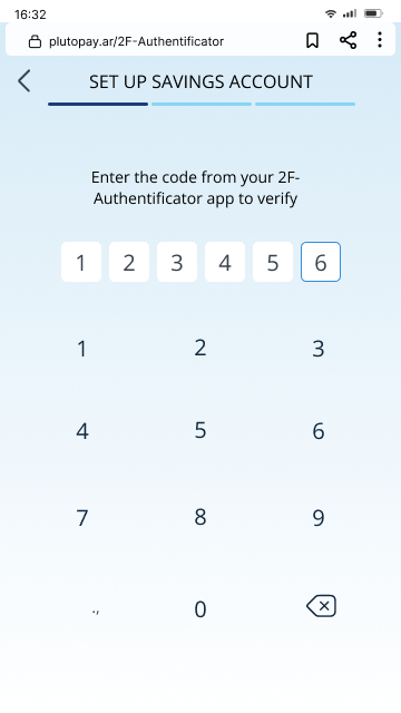
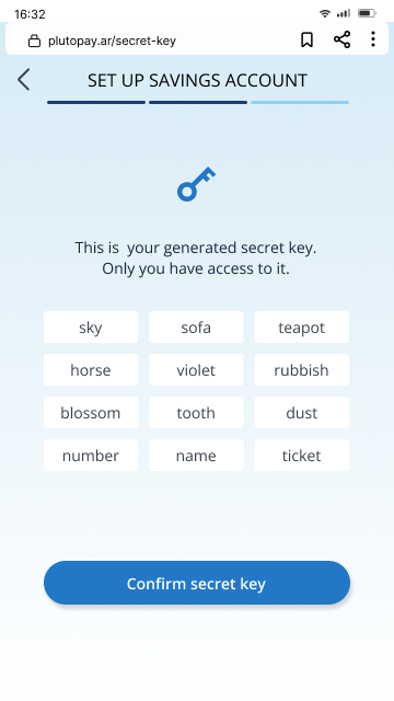
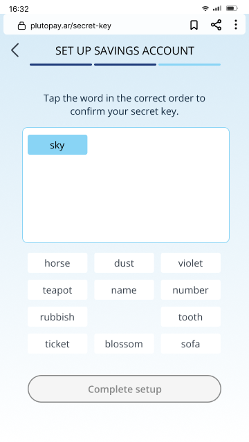
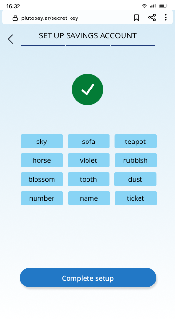
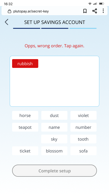
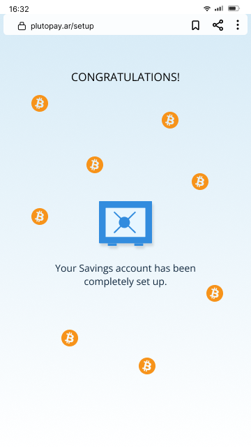
The flow of creating a self-custodied wallet is probably the most challenging to people who are not familiar with the self-custody concept. In the begining I used commonly known terms like “Wallet”, “recovery seeds”, yet these terms are not exactly industry-standardized. “Account” is then used instead of “wallet” because the app is designed for new users transitting from the legacy finance system. “Secret key” is used instead of “recovery seeds” or “seed phrase”. I want to emphasize the secretness in these words, and the “key” in the common saying “Not your key, not your coin” in the Bitcoin community. Not all people know what a key really is.
BUY BITCOIN WITH PESO
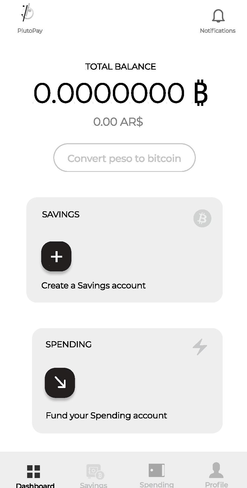
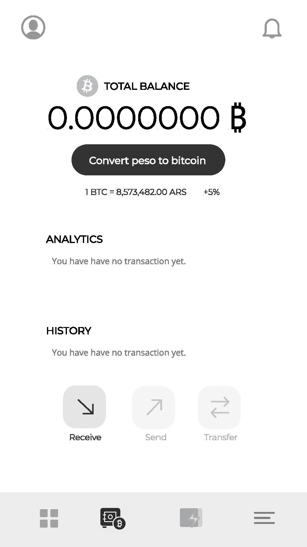
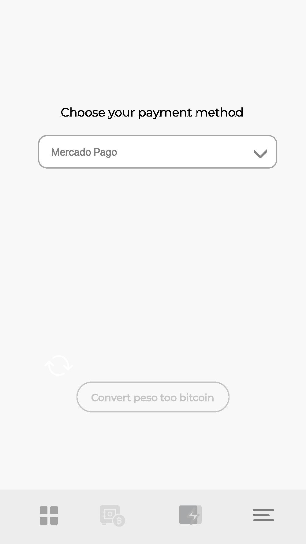
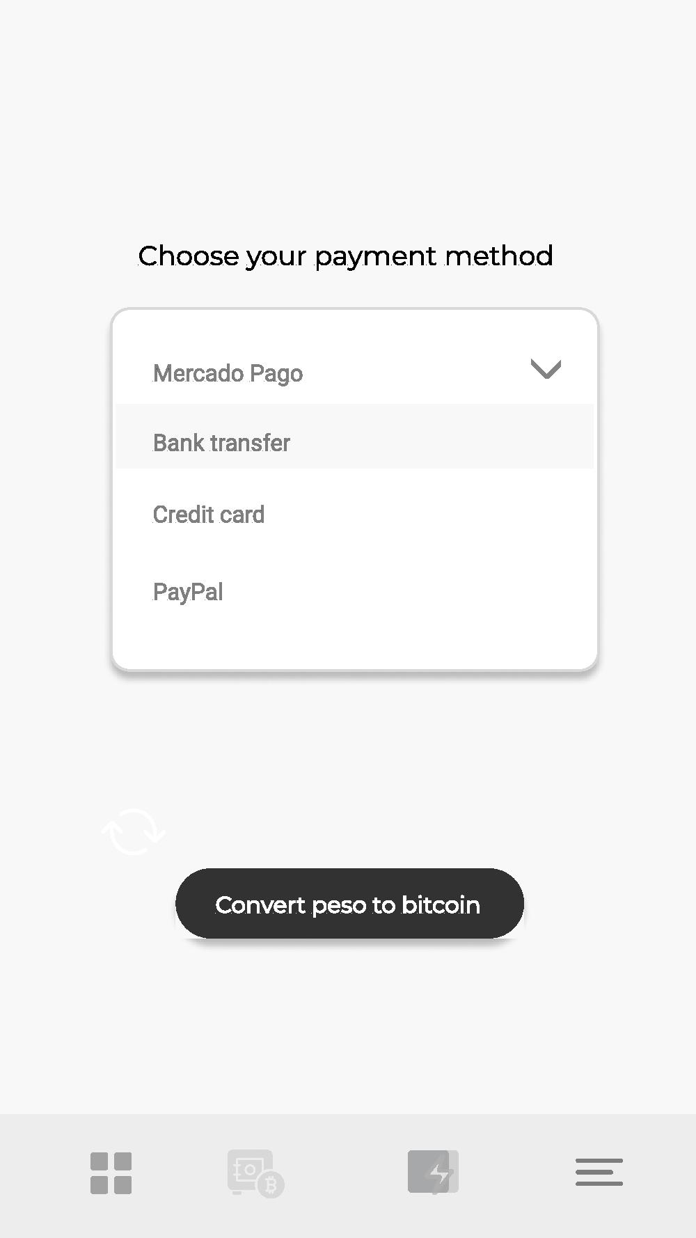
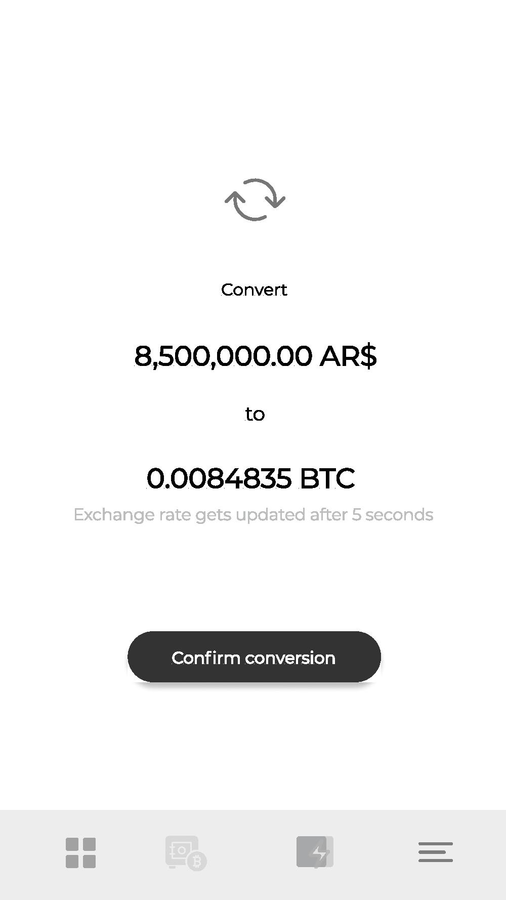
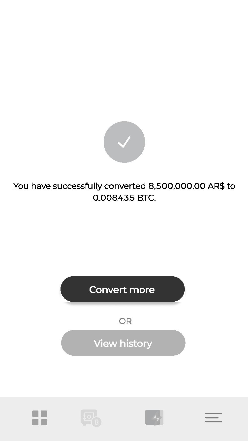
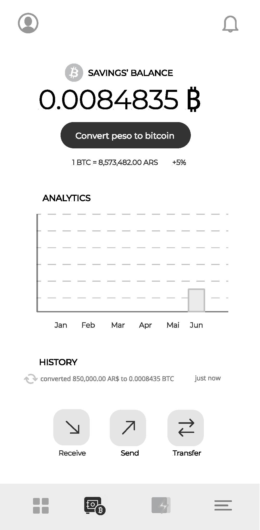
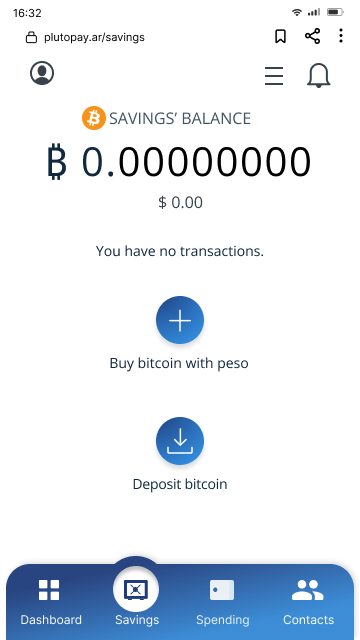
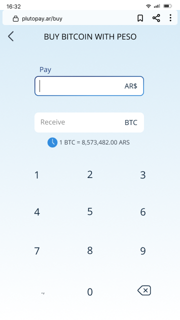
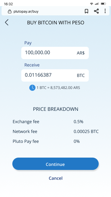
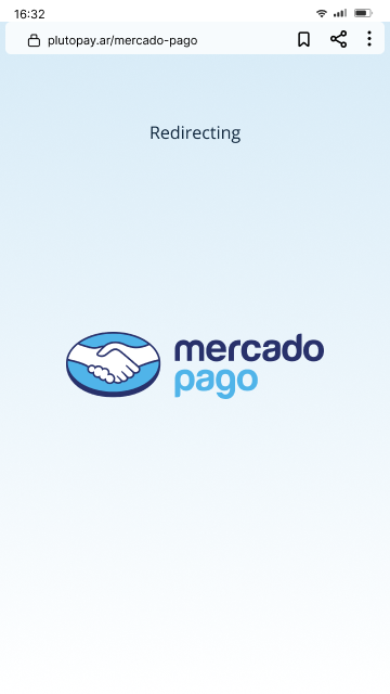
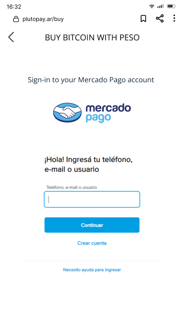
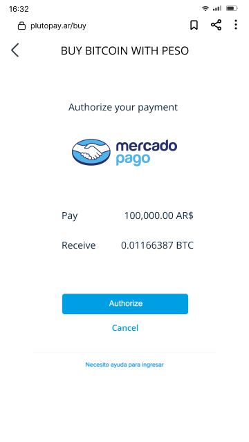
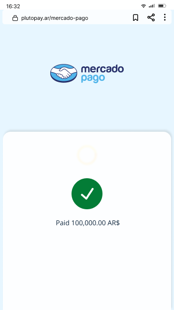
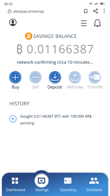
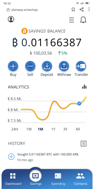
The whole purpose of the app is to escape from a devaluing currency (peso) by converting them to a better asset that retains the purchasing power (bitcoin). My original idea is to make “Convert peso to bitcoin” the major feature. It had a separate button right beneath the Total balance in the Dashboard and Savings’ balance to be accessed as easy as possible. However, one fundamental mistake I learn from the Usability Testing is you can only convert peso to bitcoin if you already have peso. Since PlutoPay is an application provider without money transmitting license, it deligates this task to financial instutions that have the priviledges to handle a sovereign currency.
DASHBOARD
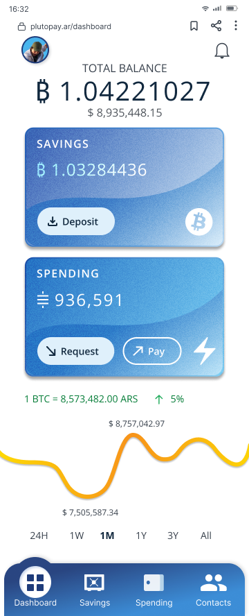
The dashboard was first packed with information. The most important elements are the two cards that show an overview of the two accounts. I revise my User journey maps again and conclude that users don’t need all addtional features. The final design chose a minimal approach, only shows what’s necessary. The cards are styled resembling a physical debit/ credit cards for a familar touch.
